The Touchscreen Laboratory
Discover how visualization and real-time analytics turn AI data into shared intelligence and collective action.

It was a long night. The professor had stayed late and, as a result, arrived at the laboratory just before noon the next day. His research team had been there early, meticulously arranging the data from the previous day’s findings onto the wall-mounted screens.
As the professor entered the room, he positioned himself in the center, where almost all the screens were within view. Most of the screens displayed real-time data, with graphs that moved and colors that shifted constantly. One gauge stood out—it was entirely red and much higher than the others. The professor asked about it immediately, but his team had no reasonable explanation.
The professor touched the red indicator on the screen, dragging it to an empty wall space. The walls and screens were touch-sensitive, responsive to hand gestures. He then brought another graph next to it, followed by another, creating a visual cluster. Finally, he placed the project’s overall model beside them, linking each indicator to the relevant subcomponent with a simple gesture. The team had a rough idea of what he was trying to do, but they couldn’t predict where it would lead.
It was as if the professor was deciphering a hidden code, aligning the graphs and indicators so that their colors and shapes formed a harmonious pattern. However, there was still a red spike in one corner—a sign that something was wrong.
“We need to solve this, team,” the professor stated. The team understood what he meant, but not how they were supposed to proceed. Seeing their confusion, the professor clarified, “This organism’s temperature is too high. The indicator is red, which means something’s off. Everything else is green, which is normal. Understood?”
The team nodded, beginning to grasp the situation. There were many possibilities to consider. They decided to project data from all the potential causes onto the screens. As they brought up the data and projected it onto the walls, the lab filled with graphs. Now, they began grouping the data based on their experience, searching for patterns, trends, or anomalies.
As they adjusted the chemical compositions in the lab’s test subjects, the graphs responded in real-time. The lab’s online and real-time measurement tools monitored everything. Meanwhile, they could also adjust the environmental conditions, increasing or decreasing temperatures, which affected the organisms, with the indicators reflecting these changes immediately.
Meanwhile, the professor had retreated to his office, where the walls were also covered with touch-sensitive screens, and his desk was a large touchscreen. He loaded all the data onto his desk, dragging the data that caught his eye onto the walls. Again, the red indicator stood out. A suspicion seemed to be forming in the professor’s mind. How could he test his theory?
By running simulations of various scenarios, he might be able to see the outcomes of different situations. He called in a senior researcher, and together they tweaked several parameters, creating different scenarios, each displayed on a separate graph on the wall. The red indicator gradually faded, its value decreasing. The professor was on the right track. The researcher understood the concept. The data trends were now clear.
They needed to model these experiments and formulate them into a replicable process. They also had to translate this model and formula into their biological experiments to validate the results in real life. The researcher asked for the professor’s permission to get the team started, and soon they were hard at work.
As the scenarios developed and progressed in the right direction, they reflected these possibilities in their experiments. The data confirmed their findings, and the scenarios helped them identify the critical indicators to monitor. With the indicators on the wall, they were always visible. The changing colors signaled whether things were going well or not.
Trend analysis graphs showed whether they were on the right path. If things took a negative turn, they could quickly pivot, avoiding wasted time and resources. The research gained significant speed and quality, boosting the team’s motivation. The professor was pleased with the progress.
One team member had an intriguing thought: If all the data was on the walls, and the walls were touch-sensitive, could they adjust the chemical doses and temperatures with a simple touch? Could the team work together, making adjustments by touch alone? This would save them even more time.
They brought in an engineering and software team. The software engineers integrated the screens with the measurement and mixing devices, while the engineers fine-tuned the sensitivity and physical integration of the devices. Now, there was no need for test tubes or pipettes; the formula developed on the screen could be directly applied to the chemicals, automating the experiments.
The electron microscope’s images were also projected onto the walls. Research data was overlaid with the images, allowing them to interpret the significance of the data directly. This visual approach gave the research a new, superior dimension.
Some team members identified different trends from the visuals, leading to derivative experiments. They expanded the scope of the research without exceeding the budget or timeline. Each trend seen in the graphs represented a significant scientific discovery. Without the data on the walls, the color-coded visuals, and advanced real-time graphs, these findings might have been missed.
One of the team’s key members was a data specialist. This person was responsible for transforming data into reports, graphs, colors, shapes, and touch-sensitive formats. They were an integral part of the research team and, as a biologist, also contributed scientifically. Combining these skills, the specialist designed unique graphs, shapes, and interfaces that had never existed before.
The experiments were completed ahead of schedule. The professor and his team made groundbreaking discoveries in genetics. Visualizing the research data accelerated the work, making it easier and revealing areas that would have been hard to see on paper. The touch-sensitive data and graphs enabled seamless integration between research and data, making the information almost tangible. The touch interface sped up the process, allowing for direct interaction with the graphs and simulations. The team worked more efficiently, collaboratively, and creatively than ever before.
At the end of the research, the professor held a press conference, emphasizing the importance and benefits of the touchscreen laboratory environment. He stated that without this setup, they could not have achieved these results.
Lessons in Innovation
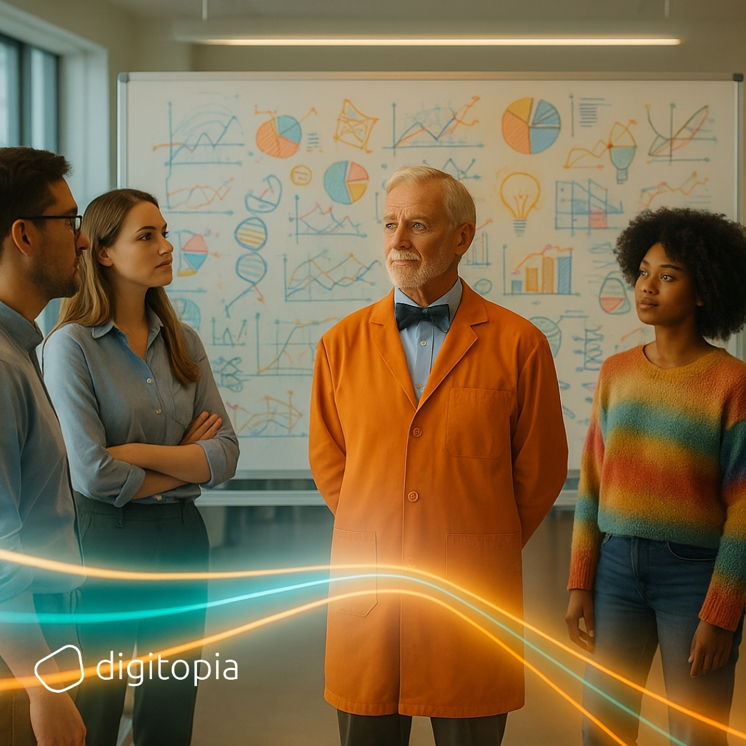
The professor was an unconventional figure at the institute, known for doing things differently. While others wore ties, he donned a bow tie. His lab coat was orange, not white. While others held press conferences, he threw wild parties. He sought out alternative funding sources for his projects instead of relying on public grants. In short, he made a point to do things differently.
In one-on-one conversations, the professor gave unexpected answers, often confusing and surprising those he spoke with. His unusual mannerisms and reactions made some people uncomfortable, leading them to avoid him. However, his work was widely respected, and his eccentricities were tolerated because of his groundbreaking discoveries and innovations.
The professor didn’t just innovate in genetic research; he also invented new measurement tools, sensors, and imaging devices that accelerated and improved the quality of research. These innovations benefited not only his work but also anyone conducting similar research.
One of the most significant recent technologies was the integration of sensors and measurement devices with chemical and molecular mixing and testing equipment. The ability to control dosage and experiment setups via touchscreen interfaces allowed for automated preparation and execution, significantly reducing time and enabling the team to focus on the scientific aspects of the research.
The professor’s team included a mathematician skilled in statistics, model theory, and applied mathematics. Although not directly involved in the research, this mathematician contributed significantly by developing mathematical models, reports, and analyses that informed the experiments.
Another key team member was a designer who wore jeans, a T-shirt, and sunglasses, with long, curly hair. This designer took the mathematician’s reports, analyses, and graphs and turned them into visually appealing, easy-to-read, and highly expressive graphics and animations. This artistic touch made it easier for the scientific team to see and understand complex issues quickly and clearly.
The team also included a specialist in new technologies, particularly in integrating touchscreen interfaces, gesture control, and voice and image recognition. This person played a crucial role in transforming the laboratory into its current state.
As seen, the professor’s team was diverse, including profiles not commonly found in genetic research teams. This diversity allowed them to achieve what others couldn’t.
Moreover, the experimental approach, a staple in scientific environments, was integral to the team’s success. The professor’s team, though initially unfamiliar with this method, quickly adapted and saw its benefits. The process accelerated, and previously unthought-of integrations were achieved thanks to this method.
The professor and his team enjoyed their work immensely. Whether their enjoyment sped up the work or the speed of the work increased their enjoyment, it’s hard to say. But there’s no doubt that both influenced each other. Therefore, to enhance your own work environment, you should focus on increasing both the speed and quality of your work.
Applying the Laboratory Experience to Corporate Environments
The theme of this section is “Visualization,” specifically the “Visualization of Data and Information.” While this is not a new concept, recent advancements have brought new dimensions to the field. The diversification of design, the development of mathematics and statistics, the proliferation of screens, the increasing quantity and importance of information, and especially the transition of screens to touch interfaces have added significant meaning and importance to the subject.
Visualization appeals to the eye, and sight is one of our most powerful senses, known for its intensive information processing capability. What we see is transmitted to our brain, where an image is formed. When combined with other senses and emotions, this creates a lasting impact and a powerful memory.
In information technology and analytics environments, visualization is about making data, insights, and distilled wisdom easier and faster to understand for employees, managers, customers, analysts, and all relevant stakeholders. It’s about translating the stories that data and information tell into a visual form that speaks to the eye.
The eccentric professor and his team’s approach can be summarized in five key steps:
- Data, Sensors, Measurement Tools, etc.
- Real-Time Integration (Operational Intelligence)
- Mathematics (Models, Formulas, Graphs)
- Art/Design (Graphics, Shapes, Colors, Animations)
- Technology (Touchscreens, Gesture Control, Voice Recognition, etc.)
The integration of visualization into corporate environments is not just a trend but a necessity for improving understanding, decision-making, and collaboration. By following these steps, businesses can transform their operations, making them more efficient, innovative, and engaging, just like the professor’s touchscreen laboratory.